Wedding Stationery

WEDDING STATIONERY

BESPOKE WEDDING PRINT DESIGN

Working on the stationery and wedding decor for such an important day was both terrifying and exciting. Be Smart felt that my illustrative skills was what made me the right person for this job. 

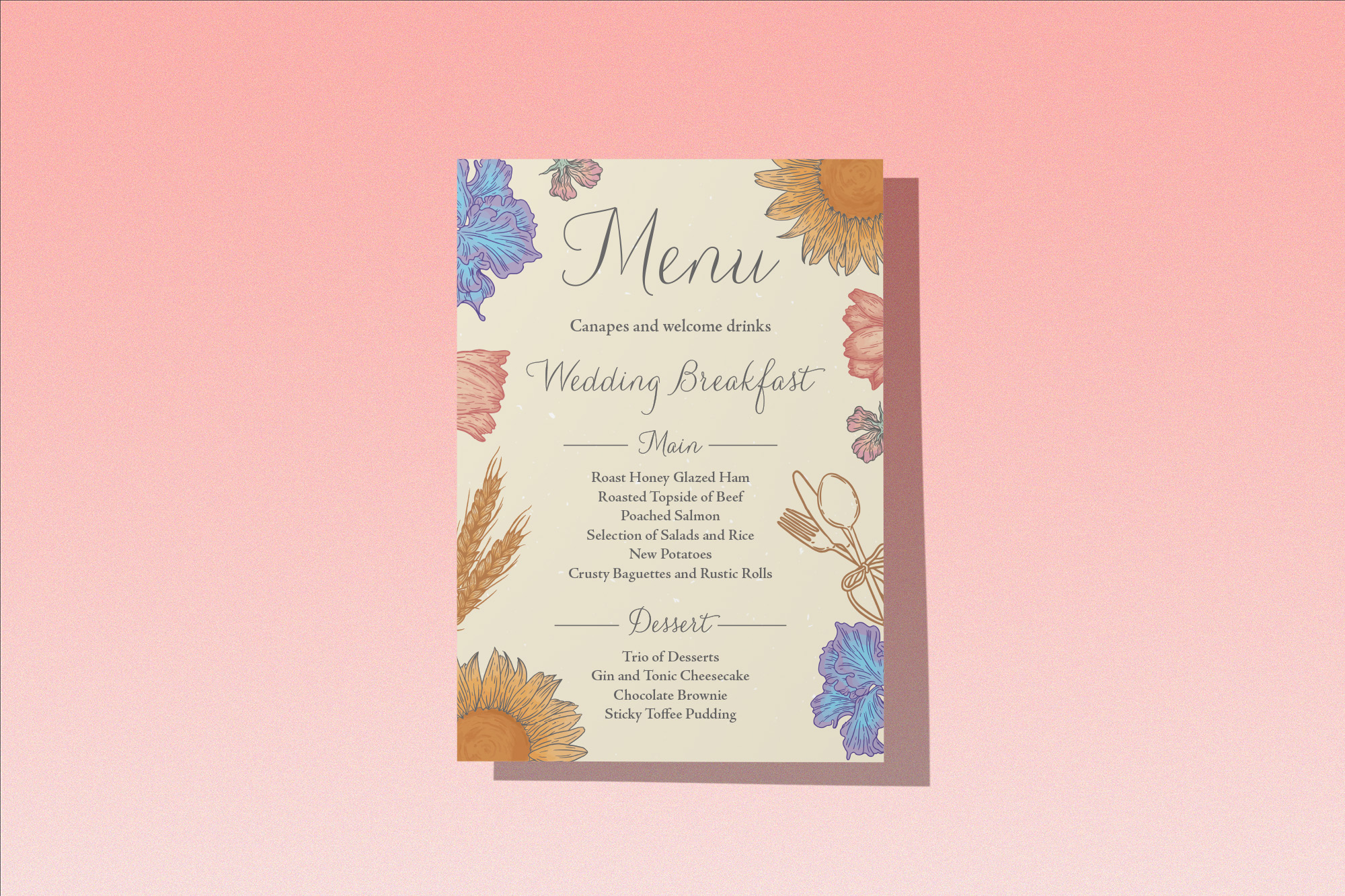
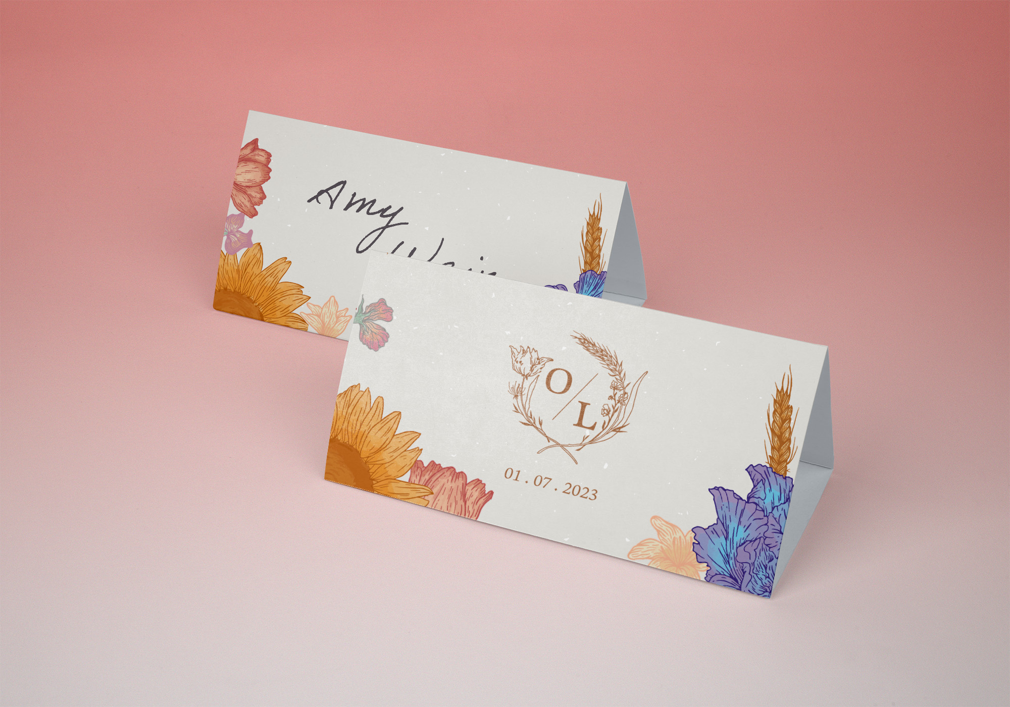
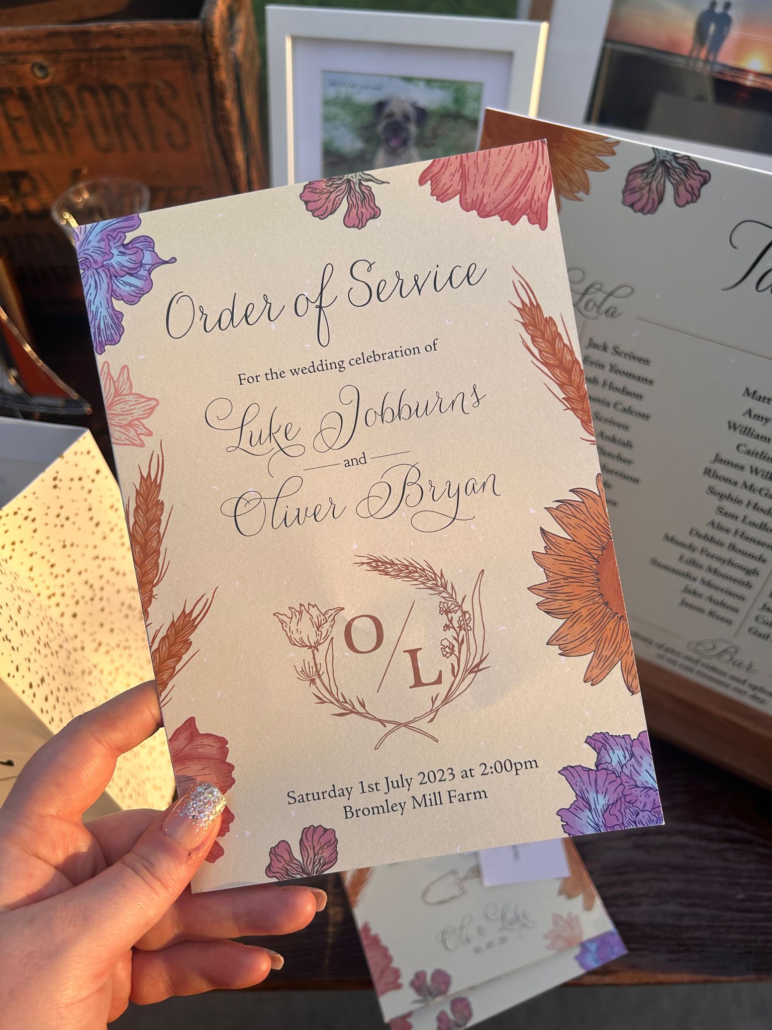
I wanted to make the stationery as special and personalised as much as possible, so discussed all of the couple’s interests, hobbies and loves – which included their beloved dog Finn, their other pets, their love of vehicles and gardening and the wedding floral arrangements. 

From day one we discussed and explored all options, taking inspiration from every aspect of the wedding plans. Colours from the flowers influenced the overall design and their personalities decided the illustrations, resulting in a truly bespoke, intimate and unique outcome. 

It was truly lovely working with the couple to create their stationery leading up to the day, for the ceremony and the evening party.


THE EVENT

I was gobsmacked when the couple invited me to their wedding party after being so happy with the work I did – and of course I attended. The event was beautiful and suited the couple so well. The stationery complimented both the event and the couple beautifully, and it was easy to the influences that went into the design.

Seeing the finished product at the event was an extremely proud moment for me, and to see the impact it had on the couple and their guests was wonderful. 

Newlife : Sparkle Day

SPARKLE DAY CAMPAIGN

CAMPAIGN IDENTITY & MATERIAL

Newlife’s Sparkle Day fundraising campaign was the first branding brief I attempted at the start of my apprenticeship – and my design was actually chosen – so this case study is near and dear to my heart.

Newlife wanted a brand identity and marketing material to raise awareness and funds for their charity for disabled children. This campaign would target nurseries, schools, colleges, and businesses and persuade them to get glammed up, put their hands in their pocket and donate to a good cause.

To give this brand identity the ‘sparkle’ factor it deserves, I create a fun and friendly logo using stars, sparkle and a smiley face. The colours uses the brands existing Newlife colours with a bright yellow to incorporate with it.

When creating the campaign marketing, we wanted to use imagery and words to give an emotive tone, so included some of the lovely photography of the children that this funding would go to support. 

Adding the elements from the logo to envelop these images only adds to the fun factor of this material – something that will be sure to grab the attention of both business owners and children.

Rosie’s Rural Services

ROSIE'S RURAL SERVICES

BRAND IDENTITY & COLLATERAL

Rosie was a lovely and enthusiastic client that approached Be Smart Design  looking for a brand identity and marketing material for her new business venture as a freelance farmhand. Again, my illustration skills came straight to the team’s mind – and they directed the entirety of this brief to me. 

After conducting the essential research for this branding, we got to work on the overall strategy for this business. I assisted Rosie in conceiving the business name of Rosie’s Rural Services, and the perfect strap line to translate Rosie’s dedication to great customer service and care for animals – ‘a passion for animals, a commitment to excellence.’

Rosie explained that she loved the colour purple, so taking inspiration from heathers found in the local flora, we carefully crafted a palette of rich purples to compliment Rosie’s dream brand.

I created both vector shape and intricate linocut style illustrations to suit the brand, depicting the animals that Rosie will work with in her business. 

I also formed a pattern using the same illustrative style of heathers for Rosies to use across her marketing material. This could be used as a subtle background element or an illustration in itself. 

The vector shapes of the animals formed a simple but effective conga line of Rosie’s furry clients to translate in a clear manner to her audience what the purpose of her business was. With a custom edited typeface and a variations to use, this logo gives Rosie’s Rural Services a classic, elegant and sophisticated look to show Rosie’s professionalism. 

With business cards, social media elements and brand, I wish Rosie all the best in her business venture – and I am so thankful that this was the first entire brief I worked on solo. 

Social Care Workforce

SOCIAL CARE WORKFORCE

BRAND IDENTITY

Staffordshire County Council requested our help with their recruitment campaign for the Social Care industry – asking for a brand identity, strategy document, and marketing material. 

This became a whole team approach to the logo design, and after we had all put forward various designs, it was my design that was chosen by the client. 
I used the purposed of this campaign to inform the design, creating an abstract shape that symbolised two figures supporting each other, a heart and a smiley face – reflecting the love, care and friendliness that goes into this line of work. This brand identity than went on to inform the designs for the marketing and strategy design created by the rest of the team.

Another strong point of mine is my in-depth and thorough research skills – something which has now be adopted by Be Smart and included in the client process to understand the brief and give the design process a kickstart in the right direction. 

This process can result in colour palettes, fonts and typefaces, mood boards, elements and tones – the building blocks of a strong brand. 

For this brief I conducted some research into the target audience of this campaign (young people) and discovered colours admired by the Gen Z community.
This research developed our design ideas, and we were able to adapt my suggestions to create a wonderful, gentle by eye-catching brand palette.